Saturday, June 12, 2010

The design

How could I design a building which addressed areas in which human movement is most prominent around the corner site which include: vehicle and foot traffic, cafes, the post office, the Newtown business institution, apartments, traffic lights and etc without giving away too much of what inside the building?


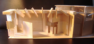
This is done by the exterior panelling which continues into the building. They have the ability to control what is shown from the exterior to the interior of the building. By creating this façade arrayed with these panels, you create an animated façade which changes as the move around the building. Which at instances the building may be seem closed at the angle of view in which your situated in but as you progress around the building the closed areas will open up to the viewer and thus creating openings into the gallery in which work can be seen. (more information on this can be seen on the link ‘ideas and development’ or through the ‘older’ posts link further down the page)
The final design, had little changes in terms of the actually art gallery/shop space. The only changes to the plan are: the spaces which are used for the office, bathroom, workshop, storage and the garage. The forms of these spaces are come from a grid which derives from the arrangement of the exterior panels.
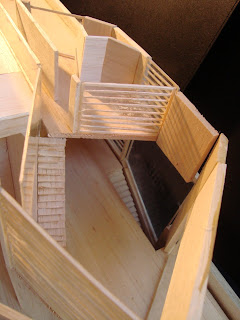
The court yard has been left as an open area which has vegetation amongst the roof and the sides. I have used planting to have a contrast of shadow types as oppose to the interior roof panels. This open area allows for flexibility in courtyard. The large wall is used as a contrasting element to the unique facade of the gallery and it is also used as a back drop for displaying art.
The gallery in terms of materials largely will be expressed in neutral colours to enhance the works within. Concrete would be used for the facade: the connection between the use of concrete and the forms of the facade has this interplay of rotating aesthetic qualities of the panels and fixed associations of the concrete material.
The apartment I have designed so that the owner is situated away from the gallery within his own space. The apartment is designed with the master bedroom on the upper levels so that the owner has views over the roof, the city and Newtown, followed by a very large open deck to compensate for the unused space on the east side of the roof. The reasoning for the two levels allows the owner to have views of the area, this resulted in the double ceiling height living space and the other apartment functions bellow.

Presentation


Ground floor and 1:1000 plan


Level one of the apartment and level two


Section one and poche rendering of the gallery


Section two and poche rendering of the gallery

External Images


King Street corner entrance


View from the accross the street


North facade


Courtyard and apartment


West facade and south corner


The roof composition

Internal images


Internal one

Internal two

Internal three

The model


Sunday, May 30, 2010

So far, the plan is..........


The plan is made up of 3 main sections:
1 The large open plan gallery / commercial space.
2 the administrative and private sector
3. The courtyard.
I find it important to have these divisions as is it is a way to reduce the conflictions between the functions of the Art gallery.
In the gallery the walls are freely designed within the open plan, the walls are designed split and to rotate giving the gallery flexibility, this also allows for the manipulation of light conditions. (The walls are addressed earlier on in the blog).
The garage, workshop/storage are all combined into one. The transportation from the deliveries to the workshop/storage is of importance. Next to one another allows for safe handling of the products.
Transport – storage – assembly – gallery
The Courtyard yard; this area will proved areas for artworks to be placed in outdoor conditions, mainly sculptures.
The residential space is to act like a separate building. As its own entity, if one day the gallery owner decides to sell the residential space or the gallery, neither one would be effect by its sale. As they are in their own divisions.

ideas and developments

How could I design a building which addressed these areas in which human movement is most prominent without giving away to much of what inside the building?


The solution was to create a façade which was open to the angle of view in which you are situated around the building. By using fixed louvers, this also controlled what was able to be viewed in the interior. By creating this façade arrayed with these panels, you create an animated façade which changes as the move around the building. This allows the artworks within to be visible one moment and then obstructed the next.


The façade is then translated into the roof, this does the same effect except in terms of lighting conditions. Through sunlight which is directed mainly through the roof, you are able to get different lighting variations on various types of artworks, especially sculptures. The ability to have the option to use diffused, direct or even unnatural light allows you to display your works in a dynamic manor.


A combined gallery/commercial space is important so you are able to maximize displaying space. They also should not be separate as you can deplete the quality of art within the gallery, by putting them into different categories you create a hierarchy. The walls within the large shell like space are walls which have the ability to split and rotate on a hinge. The walls are used to display photographs, 2D forms of artworks and they can play as an important backdrop to sculptures. These walls translate into the aesthetics of the fixed façade and have the ability to reflect light within the spaces, allowing artworks to be enhanced and highlighted. As art is sold, the art is replaced;the walls which have no load baring considerations and have the ability to move, you create a space which is dynamic and adjustable to the various forms of art allowing flexibility to the future needs of the gallery.