This is done by the exterior panelling which continues into the building. They have the ability to control what is shown from the exterior to the interior of the building. By creating this façade arrayed with these panels, you create an animated façade which changes as the move around the building. Which at instances the building may be seem closed at the angle of view in which your situated in but as you progress around the building the closed areas will open up to the viewer and thus creating openings into the gallery in which work can be seen. (more information on this can be seen on the link ‘ideas and development’ or through the ‘older’ posts link further down the page)
The final design, had little changes in terms of the actually art gallery/shop space. The only changes to the plan are: the spaces which are used for the office, bathroom, workshop, storage and the garage. The forms of these spaces are come from a grid which derives from the arrangement of the exterior panels.
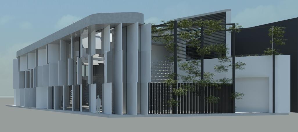
The court yard has been left as an open area which has vegetation amongst the roof and the sides. I have used planting to have a contrast of shadow types as oppose to the interior roof panels. This open area allows for flexibility in courtyard. The large wall is used as a contrasting element to the unique facade of the gallery and it is also used as a back drop for displaying art.
The gallery in terms of materials largely will be expressed in neutral colours to enhance the works within. Concrete would be used for the facade: the connection between the use of concrete and the forms of the facade has this interplay of rotating aesthetic qualities of the panels and fixed associations of the concrete material.
The apartment I have designed so that the owner is situated away from the gallery within his own space. The apartment is designed with the master bedroom on the upper levels so that the owner has views over the roof, the city and Newtown, followed by a very large open deck to compensate for the unused space on the east side of the roof. The reasoning for the two levels allows the owner to have views of the area, this resulted in the double ceiling height living space and the other apartment functions bellow.